|
 |
Horizon Mapping
Tutor/Mentor Connection: Map Galleries
|
|
|
|
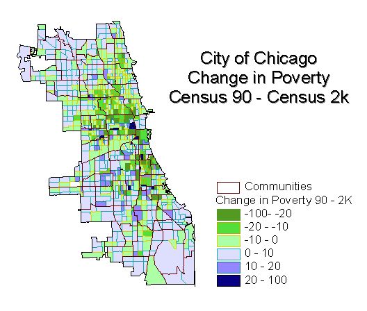
Change in Chicago Poverty
This map shows how the population below the poverty
level has changed from 1990 to 2000. The greens indicate that there are fewer
people below the poverty level in 2000. Blues indicate an increase in people
below the poverty level. There are two clusters of positive change, one north
of Interstate 55 and one to the south. These areas are where poverty was
greatest in 1990 as well as in 2000. Things are getting better, but there is
still much room for improvement.
|
|
|
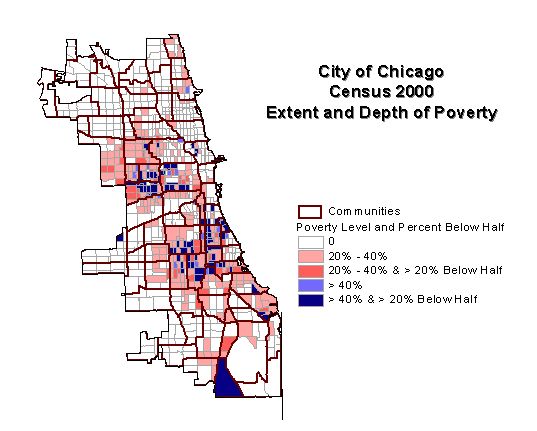
Chicago Poverty in 2000
This map is similar to the TMC maps of poverty in 1990. It shows the percent of the
population below the poverty level by Block Group area. In addition it shows the depth
of poverty by showing how many of those in poverty have an income less than half of
the poverty level. This additional parameter helps us focus on those areas that have
the greatest need.
|
|
|
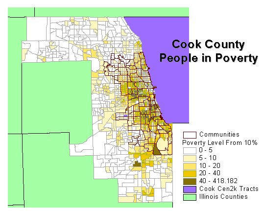
Cook County Poverty in 2000
This map shows the extent of poverty in all of Cook Co. It indicates that poverty
is not just in the inner city. TMC maps usually show where at least 20% of the
population is below the poverty level. By mapping those areas where the percentage
is 10% and 5% we get a broader view of where people benefit from development programs
like mentoring and tutoring.
|
|
|
Chicago Poverty and Poorly Performing Schools
At the end of 2001 the Illinois State Board of Education release a warning list of poorly
performing schools in the state. This map shows the relationship of poverty to poorly
performing schools in the City of Chicago. The concentration of these schools is greatest
in those areas of greater poverty. Mentoring and Tutoring programs in the area provide
support activities to children that are designed to turn this trend around.
|

|
|
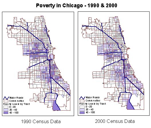
Poverty in Chicago - 1990 vs. 2000
In the ten years since the last Census, much progress has been made in identifying
those areas where children are at risk and linking them with programs that can make
a difference. As can be seen from the two maps comparing poverty in 1990 with
poverty in 2000, there is still much to be done. There is also a continuing
need to sustain the efforts already being made.
|
|
|
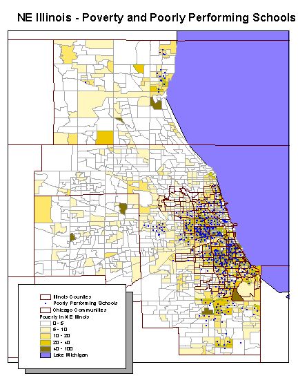
Poverty and Poorly Performing Schools in NE Illinois
Much of the effort to counteract the effects of poverty on children in the last
ten years has been focused on the Chicago area proper. As can be seen from the
map of NE Illinois, the concentration of poorly performing schools in the city
illustrates why this is a primary area of concern. As the map also shows, there
are schools at risk outside the city as well as areas of poverty. As we build
up the programs to support children in the central city, we should also begin
to look to the outlying communities and address any shortfalls in development
programs so that no child slips through the cracks.
|
|
|
|
|
|